BACKGROUND
Payback is a coupon app, where you use coupons to earn points, which you can then use to unlock more coupons. It’s currently Germanys “#1 Free Loyalty Program”. They have partnerships with many well-known, big-name brands like Nike or H&M. It was founded in Munich and has over 31 million users in Germany alone.
Challenge
Over the course of two weeks my project partner, Joyce, and I took on the challenge of re-designing an already existing app. We are both based in Berlin so we chose to go with a German app, and one that is well established. Payback stood out to us, because of the potential we saw in the redesign.
Goal
Our goal was to enhance the overall user experience of an already existing application, and we chose to redesign the well-known app Payback. Deliverables would include one user flow, with the newly designed version being a high fidelity MVP, and an improvement to the overall design.
RESEARCH (week 1)
We dissected the app with an Heuristic Evaluation. As the app is currently, there was a lot to unpack.
The main pain point is it’s lack of visually appeal or simplicity, especially when it comes to navigation. It felt like a maze to find what we were looking for when doing our research.
We created an asset library to break down all the elements of the app.
Though the app has partnerships with hundreds of brands, many coupons only apply to the online-stores of these shops. To use the coupons, you have to access the shop through the app, which is confusing, hard to navigate and leads to a lot of time spent waiting for things to load. Therefore, to create a better MVP, we decided to focus on the coupons that are able to be used in store.
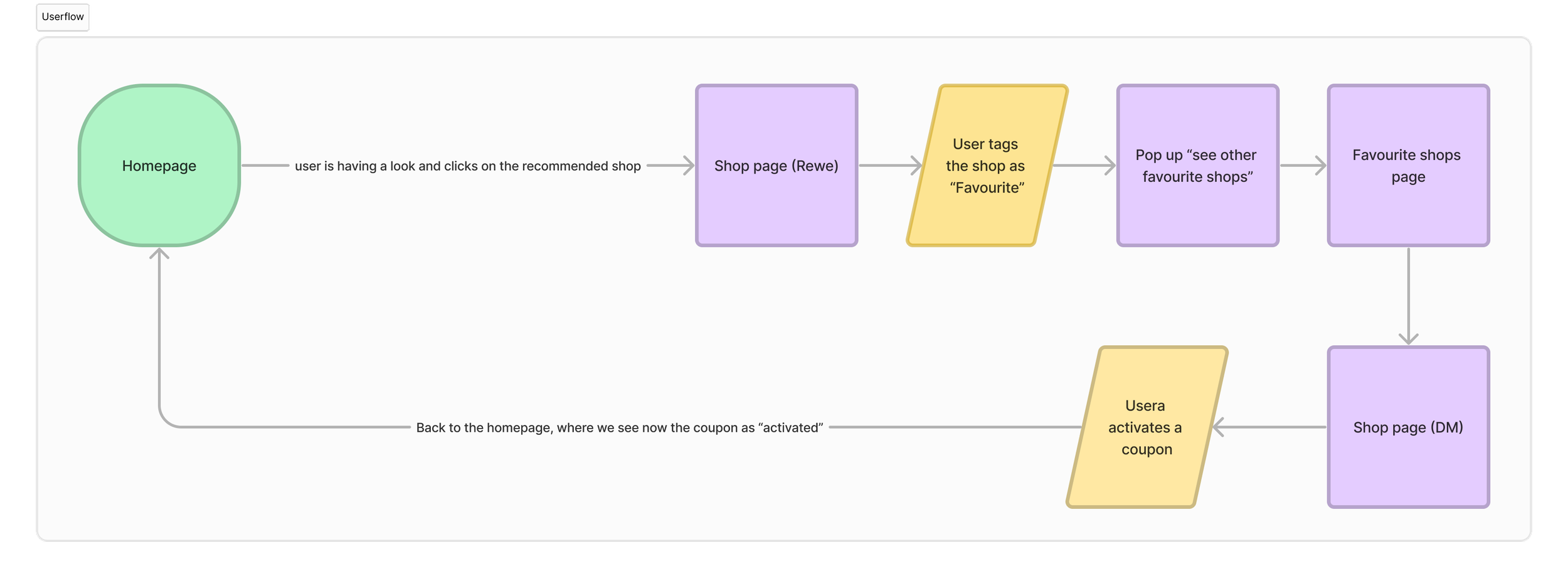
Our main goal became to make the coupons more accessible, and to create a user flow that demonstrates how to easily activate and then use a coupon in store, through the app. We wanted to not only to be more aesthetic, but also convenient, to entice more users to engage with the product.
By the end of the first week, we were able to start brainstorming our information architecture and our user flow.
We agreed that we didn’t need to change the information that the app provided, but more so change the structure and navigation. The content is there, just out of order.
We looked at other products on the market, offering similar services.
Deutschland Card is Paybacks direct competitor, while Groupon is a global competitor.
Our main take-aways:
GroupOn was definitely more organized, while Deutschland Card is more in line with Payback, as it currently is aesthetically.
GroupOn did come across as a more refined brand out of the three, and it was something that we also wanted to strive for.
Style Guide inspiration. We were able to pick up on their values, which directly influenced our revised brand standards for Payback.
DESIGN (week 2)
We did not change the primary colors, because we felt the blue was appropriate (felt welcoming and honest), and would continue to make it stand out from its competitors.
But as the app currently stands, we were easily able to spot 17 colors, not including grays and blacks, that are generously used throughout the app. So we planned on applying a limited palette.
The brand values that we wanted to display through our visuals and language were:
Energetic, Community Oriented, Practical, Trustworthy.
With these values in mind, we set out to set our design standards. Our vision for the new design:
After 1.5 weeks, we had finished a high fidelity MVP and were ready for user testing.
After asking some users to complete a few simple tasks and navigate through our user flow, we received much anticipated feedback.
Our users:
Enjoy how simple the product is. “There is not too much information.”
Would prefer an easier way to user coupons
Found some of the functionalities, such as the Barcode, to not be very clear as a new user
We took all of this feedback into account and made a few changes.
IMPACT
Our final designs fulfill our goals of enhancing the user experience by:
allowing users to easily access coupons from various points in the product
prioritizing access to the in-store coupons, while providing an easy option to switch to the online store
simplifying the user flow to access and activate a coupon for in-store use
Through these points, users of the app Payback can have a more positive experience while using the product, through its clear interface, simple color palette and easy to use coupon process.
OUR NEXT STEPS
Creating the online shop. We have currently only designed screens that apply to coupons that can be used in-store.
Map on the Shop Page. This would allow users to easily find locations near then, where they can use their coupons. It would also allow filters to be applied for the types of products or stores that a use is searching for.
Personal Settings. This includes a log in screen, as well as a profile page, where users can enter personal preferences and relevant information.
WHAT I LEARNED
The importance of simple design. Overcomplicating an idea is easy, breaking it down to the necessities is hard. There were so many little details that we initially wanted to include, and we had to let them go, in order to stay true to what we wanted to present.
The duality of function vs. aesthetic. Though we may complain about apps that present themselves this way, they of course are aware of what they’re doing. Like Amazon, Payback looks the way it does on purpose. Rather than spend time and money on the visuals, certain brands focus on function, purpose and results. But then again, why can’t we have both?


